Magazine Redesign
Upper & Lowercase
PROJECT BRIEF: Re-imagine the typography-focused magazine Upper & Lowercase. Design a logo, cover, and spread for the magazine. Focus on a central theme related to typography and develop supporting article headlines.


RESEARCH & MOOD BOARDS: I began by researching Upper & Lowercase (U&lc). The magazine ran from 1970-1999 and this time period informed my design decisions when approaching a logo and theme. I organized my research into separate mood boards for U&lc, cover inspiration, and logos. I was inspired by the limited color palettes in original U&lc covers. I loved the yellowing pages and textures that showed aging.


LOGO SKETCHES: I started my logo design process by sketching a few thumbnails. I explored mixing serif and sans serif fonts to reflect the simple and vintage aesthetics I’d liked in the research phase.

LOGO REVISION: I digitized and iterated on my favorite thumbnail sketches After receiving peer feedback, there was a clear favorite. The combination of serifs and swashes in a minimal color palette make the logo feel timeless and uniquely recognizable.


COVER SKETCHES: I sketched some thumbnails to get a feel for placement of the logo, masthead, main article, and supporting articles. From my moodboard research, I knew I wanted a large photo and lots of negative space. Keeping the supporting articles really small supported a strong sense of hierarchy.

COVER REVISION: I used the thumbnails as a guide to create some rough digital compositions. I printed all 5 out at full size for peer feedback. The green one was a favorite and felt like it aligned closest to the original theme set in the moodboarding phase.


COVER REVISION: I made some slight adjustments to sizing of the margins supporting articles, then added distressing and texture to the cover in Photoshop to make the magazine feel aged.

SPREAD DESIGN: I started with 5 spread ideas that I printed out at full size for peer feedback. I moved forward with three favorites and feedback that the layouts felt minimalist and looked more like an advertisement than a magazine article.


SPREAD REVISION: I narrowed my focus to three and added details like a kicker, introduction, page numbers, headers, and website links to make the spreads feel more professional. I changed direction entirely for the Pall Mall feature. I felt that all of my spreads had a very similar structure and wanted to experiment with a grid layout.


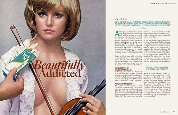
FINAL + MOCK: For the final version, I chose this violin spread because of the emotional punch that the eye contact delivers. I reduced point size of the article title so that it wouldn’t cross the centerfold, making it easier to read. I increased thumb space on the right page and added a kicker before the intro.