


Book Cover
Pippi Longstocking
PROJECT BRIEF: Design a book cover for Penguin's modern release of Pippi Longstocking by Astrid Lindgren.
PROBLEM: The cover must compete on a shelf with modern children's books.
DESIGN INTENT: Capture the playful and ornery spirit of both author and main character.
INSIGHT: I really love the process of creating analog illustrations and applying them in a digital context!
OUTCOME: A streamlined design methodology from mind map to final mockup that can be applied to future design projects of any genre
SEE THE FULL CASE STUDY HERE

RESEARCH AND MIND MAP: As I read Pippi Longstocking, playfulness and rebellion stuck out as themes, and I created mind maps for each. I explored what those topics looked and felt like as a way to generate visual inspiration.


RESEARCH: Author Astrid Lindgren was a fierce woman with rebellious and playful streaks herself. I wanted to pay homage to her spirit in my redesign. I examined previous covers and watched the 1988 movie to see how other artists had addressed these themes.


MOODBOARD: I used my mind maps as a jumping off point to build the mood board. I gathered inspiration from what current children's book designers were doing. At this point I was really interested in simple shapes, bright colors, portraits with ornery facial expressions, and hand-made collages.

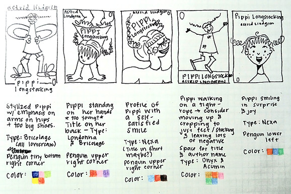
THUMBNAILS: I sketched thumbnails, noting possible color palettes and font choices for the covers. I played with ornery facial expressions embodying playfulness and rebellion. After peer feedback, I had a few ideas that I wanted to develop further into roughs.

ROUGHS: To characterize playfulness, I broke out the craft supplies.


I also used watercolors to illustrate portraits from my thumbnails.


DIGITAL ROUGHS: I added title, author name, and the Penguin logo to give a more polished feel.


FINAL: After getting more feedback, the craft supply approach felt like it lacked the necessary sophistication to compete in the competitive children's book marketplace. I moved forward with the watercolor as the final cover design.
